Introduction - A statistical prelude
ROC curves were developed in the 1950's as a by-product of research into making sense of radio signals contaminated by noise. More recently it's become clear that they are remarkably useful in medical decision-making. That doesn't mean that they are always used appropriately! We'll highlight their use (and misuse) in our tutorial. We'll first try to move rapidly through basic stats, and then address ROC curves. We'll take a practical, medical approach to ROC curves, and give a few examples.
Consider patients in intensive care (ICU). One of the major causes of death in such patients is "sepsis". Wouldn't it be nice if we had a quick, easy test that defined early on whether our patients were "septic" or not? Ignoring for the moment what sepsis is, let's consider such a test. We imagine that we take a population of ICU patients, and do two things:
Please note (note this well) that we have represented our results as fractions, and that: FNF + TPF = 1 In other words, given FNF, the False Negative Fraction, you can work out TPF, the True Positive Fraction, and vice versa. Similarly, the False Positive Fraction and True Negative Fraction must also add up to one - those patients who really have NO sepsis (in our example) must either be true negatives, or misclassified by the test as positives despite the absence of sepsis. In our table, TPF represents the number of patients who have sepsis, and have this corroborated by having a "high" TEST (above whatever cutoff level was chosen). FPF represents false positives - the test has lied to us, and told us that non-septic patients are really septic. Similarly, true negatives are represented by TNF, and false negatives by FNF. In elementary statistical texts, you'll encounter other terms. Here they are:
Probability and StatSpeakNot content with the above terms and abbreviations, statisticians have further confused things using the following sort of terminology: P( T+ | D- ) Frightening, isn't it? Well, not when one realises that the above simply reads "the probability of the test being positive, given that the disease is not present". T+ is simply an abbreviation for "a positive test", and "D-" is similarly a shorthand for "the disease isn't present". P(something) is a well-accepted abbreviation for "the probability of the event something", and the vertical bar means "given that". Not too difficult! So here are the translations:
Using similar notation, one can also talk about the prevalence of a disease in a population as "P(D+)". Remember (we stress this again!) that the false negative fraction is the same as one minus the true positive fraction, and similarly, FPF = 1 - TNF. KISSWe'll keep it simple. From now on, we will usually talk about TPF, TNF, FPF and FNF. If you like terms like sensitivity, specificity, bully for you. Substitute them where required! TruthConsider our table again:
See how we've assumed that we have absolute knowledge of who has the disease (here, sepsis), and who doesn't. A good intensivist will probably give you a hefty swipe around the ears if you go to her and say that you have an infallible test for "sepsis". Until fairly recently, there weren't even any good definitions of sepsis! Fortunately, Roger Bone (and his committee) came up with a fairly reasonable definition. The ACCP/CCM consensus criteria [Crit Care Med 1992 20 864-74] first define something called the Systemic Inflammatory Response Syndrome, characterised by at least two of:
The above process is often abbreviated to "SIRS". The consensus criteria then go on to define sepsis: When the systemic inflammatory response syndrome is the result of a confirmed infectious process, it is termed 'sepsis'. Later, they define 'severe sepsis' (which is sepsis associated with organ dysfunction, hypoperfusion, or hypotension. "Hypoperfusion and perfusion abnormalities may include, but are not limited to lactic acidosis, oliguria, or an acute alteration in mental status"). Finally, 'septic shock' is defined as sepsis with hypotension, despite adequate fluid resuscitation, along with the presence of perfusion abnormalities. Hypotension is a systolic blood pressure under 90 mmHg or a reduction of 40(+) mmHg from baseline. The above definitions have been widely accepted. Now, there are many reasons why such definitions can be criticised. We will not explore such criticism in detail but merely note that:
Despite the above limitations, one needs some starting point in defining sepsis, and we will use the ACCP/SCCM criteria. Our problem then becomes one of differentiating between patients with SIRS without evidence of bacterial infection, and patients who "truly" have sepsis. (We will not here examine whether certain patients have severe systemic infection without features of SIRS). The magnificent ROC!Remember that, way back above, we said that our TEST is "positive" if the value was above some arbitrary cutoff, and "negative" if below? Central to the idea of ROC curves (receiver operating characteristic, otherwise called 'relative operating characteristic' curves) is this idea of a cutoff level. Let's imagine that we have two populations - septic and non-septic patients with SIRS, for example. We have a TEST that we apply to each patient in each population in turn, and we get numeric results for each patient. We then plot histograms of these results, for each population, thus:
Play around with the above simple applet - move the (green) demarcating line from low to high (left to right), and see how, as you move the test threshold from left to right, the proportion of false positives decreases. Unfortunately, there is a problem - as we decrease the false positives, so the true positives also decrease! As an aside, note how we have drawn the curve such that where the curves overlap, we've shaded the overlap region. This is ugly, so in future, we'll leave the overlap to your imagination, thus:
Now we introduce the magnificent ROC! All an ROC curve is, is an exploration of what happens to TPF and FPF as we vary the position of our arbitrary TEST threshold. (AUC refers to the Area under the curve and will be discussed later).
Watch how, as you move the test threshold from right to left using the 'slider' bar at the bottom, so the corresponding point on the ROC curve moves across from left to right! Why is this? Simple. If our threshold is very high, then there will be almost no false positives .. but we won't really identify many true positives either. Both TPF and FPF will be close to zero, so we're at a point low down and to the left of the ROC curve. As we move our test threshold towards a more reasonable, lower value, so the number of true positives will increase (rather dramatically at first, so the ROC curve moves steeply up). Finally, we reach a region where there is a remarkable increase in false positives - so the ROC curve slopes off as we move our test threshold down to ridiculously low values. And that's really that! (We will of course explore a little further). Playing with ROCsIn this section we will fool around with ROCs. We will:
Let's play some more. In the following example, see how closely the two curves are superimposed, and how flat the corresponding ROC curve is! This demonstrates an important property of ROC curves - the greater the overlap of the two curves, the smaller the area under the ROC curve.
Vary the curve separation using the upper "slider" control, and see how the ROC curve changes. When the curves overlap almost totally the ROC curve turns into a diagonal line from the bottom left corner to the upper right corner. What does this mean? Once you've understood what's happening here, then the true power of ROCs will be revealed. Let's think about this carefully.. Let's make an ROC curve
Consider two populations, one of "normal" individuals and another of those with a disease. We have a test for the disease, and apply it to a mixed group of people, some with the disease, and others without. The test values range from (say) zero to a very large number - we rank the results in order. (We have rather arbitrarily decided that patients with bigger test values are more likely to be 'diseased' but remember that this is not necessarily the case. Of the thousand possibilities, consider patients with low serum calcium concentrations and hypoparathyroidism - here the low values are the abnormal ones). Now, here's how we construct our curve..
Consider two tests. The first test is good at discriminating between patients with and without the disease. We'll call it test A. The second test is lousy - let's call it test Z. Let's examine each:
From the above, you can get a good intuitive feel that the closer the ROC curve is to a diagonal, the less useful the test is at discriminating between the two populations. The more steeply the curve moves up and then (only later) across, the better the test. A more precise way of characterising this "closeness to the diagonal" is simply to look at the AREA under the ROC curve. The closer the area is to 0.5, the more lousy the test, and the closer it is to 1.0, the better the test! The Area under the ROC curve is non-parametric!The real beauty of using the area under this curve is its simplicity. Consider the above process we used to construct the curve - we simply ranked the values, decided whether each represented a true or false positive, and then constructed our curve. It didn't matter whether result number 23 was a zillion times greater than result number 24, or 0.00001% greater. We certainly didn't worry about the 'shapes of the curves', or any sort of curve parameter. From this you can deduce that the area under the ROC curve is not significantly affected by the shapes of the underlying populations. This is most useful, for we don't have to worry about "non-normality" or other curve shape worries, and can derive a single parameter of great meaning - the area under the ROC curve!
In an authoritative paper, Hanley and McNeil [Radiology 1982 143 29-36] explore the concept of the area under the ROC curve. They show that there is a clear similarity between this quantity and well-known (at least, to statisticians) Wilcoxon (or Mann-Whitney) statistics. Considering the specific case of randomly paired normal and abnormal radiological images, the authors show that the area under the ROC curve is a measure of the probability that the perceived abnormality of the two images will allow correct identification. (This can be generalised to other uses of the AUC). Note that ROC curves can be used even when test results don't necessarily give an accurate number! As long as one can rank results, one can create an ROC curve. For example, we might rate x-ray images according to degree of abnormality (say 1=normal, 2=probably normal, and so on to 5=definitely abnormal), check how this ranking correlates with our 'gold standard', and then proceed to create an ROC curve. Hanley and McNeil explore further, providing methods of working out standard errors for ROC curves. Note that their estimates for standard error (SE) depend to a degree on the shapes of the distributions, but are conservative so even if the distributions are not normal, estimates of SE will tend to be a bit too large, rather than too small. (If you're unfamiliar with the concept of standard error, consult a basic text on statistics). In short, they calculate standard error as
             ___________________________________________
            /
SE = __    /  A (1-A) + (na-1)(Q1 - A2)+(nn-1)(Q2 - A2)
       \  /   -----------------------------------------
        \/                     nann
Where A is the area under the curve, na and nn are the number of abnormals and normals respectively, and Q1 and Q2 are estimated by:
          Q1 = A / (2 - A)
          Q2 = 2A2 / (1 + A)
Note that it is extremely silly to rely on Gaussian-based formulae to calculate standard error when the number of abnormal and normal cases in a sample are not the same. One should use the above formulae. Sample SizeNow that we can calculate the standard error for a particular sample size, (given a certain AUC), we can plan sample size for a study! Simply vary sample size until you achieve an appropriately small standard error. Note that, to do this, you do need an idea of the area under the ROC curve that is anticipated. Hanley and McNeil even provide a convenient diagram (Figure 3 in their article) that plots number against standard error for various areas under the curve. As usual, standard errors vary with the square root of the number of samples, and (as you might expect) numbers required will be smaller with greater AUCs. Planning sample size when comparing two testsROC curves should be particularly valuable if we can use them to compare the performance of two tests. Such comparison is also discussed by Hanley and McNeil in the above mentioned paper, and a subsequent one [Hanley JA & McNeil BJ, Radiology 1983 148 839-43] entitled A method of comparing the areas under Receiver Operating Characteristic curves derived from the same cases. Commonly in statistics, we set up a null hypothesis (that there is no statistically significant difference between two populations). If we reject such a hypothesis when it should be accepted, then we've made a Type I error. It is a tradition that we allow a one in twenty chance that we have made a type I error, in other words, we set our criterion for a "significant difference" between two populations at the 5% level. We call this cutoff of 0.05 "alpha". Less commonly discussed is "beta", (ß) the probability associated with committing a Type II error. We commit a type II error if we accept our null hypothesis when, in fact, the two populations do differ, and the hypothesis should have been rejected. Clearly, the smaller our sample size, the more likely is a type II error. It is common to be more tolerant with beta - to accept say a one in ten chance that we have missed a significant difference between the two populations. Often, statisticians refer to the power of a test. The power is simply (1 - ß), so if ß is 10%, then the power is 90%. In their 1982 paper, Hanley & McNeil provide a convenient table (Table III) that gives the numbers of normal and abnormal subjects required to provide a probability of 80%, 90% or 95% of detecting differences between various ROC areas under the curve (with a one sided alpha of 0.05). For example, if we have one AUC of 0.775 and a second of 0.900, and we want a power of 90%, then we need 104 cases in each group (normals and abnormals). Note that generally, the greater the areas under both curves, the smaller the difference between the areas needs to be, to achieve significance. The tables are however not applicable where two tests are applied to the same set of cases. The approach to two different tests being applied to the same cases is the subject of Hanley & McNeil's second (1983) paper. This approach is discussed next. Actually comparing two curvesThis can be non-trivial. Just because the areas are similar doesn't necessarily mean that the curves are not different (they might cross one another)! If we have two curves of similar area and still wish to decide whether the two curves differ, we unfortunately have to use complex statistical tests - bivariate statistical analysis. In the much more common case where we have different areas derived from two tests applied to different sets of cases, then it is appropriate to calculate the standard error of the difference between the two areas, thus:
                     ____________________
                 _  /
  SE(A1 - A2) =   \/  SE2(A1) + SE2(A2)
Such an approach is NOT appropriate where two tests are applied to the same set of patients. In their 1983 paper, Hanley and McNeil show that in these circumstances, the correct formula is:
                     __________________________________
                _  /
  SE(A1 - A2) =  \/  SE2(A1) + SE2(A2) - 2r.SE(A1)SE(A2)
where r is a quantity that represents the correlation induced between the two areas by the study of the same set of cases. (The difference may be non-trivial - if r is big, then we will need far fewer cases to demonstrate a difference between tests on the same subjects)! Once we have the standard error of the difference in areas, we can then calculate the statistic: z = (A1 - A2) / SE(A1-A2) If z is above a critical level, then we accept that the two areas are different. It is common to set this critical level at 1.96, as we then have our conventional one in twenty chance of making a type I error in rejecting the hypothesis that the two curves are similar. (Simplistically, the value of 1.96 indicates that the areas of the two curves are two standard deviations apart, so there is only an ~5% chance that this occurred randomly and that the curves are in fact the same). In the circumstance where the same cases were studied, we still haven't told you how to calculate the magic number r. This isn't that simple. Assuming we have two tests T1 and T2, that classify our cases into either normals (n) or abnormals (a), and we have already calculated the ROC AUCs for each test (Let's call these areas A1 and A2). The procedure is as follows:
Sources of Error
The effect of noiseLet's consider how "random noise" might affect our curve. Still assuming that we have a 'gold standard' which confirms the presence or absence of disease, what happens as 'noise' confuses our test, in other words, when the test results we are getting are affected by random variations over which we have no control. If we start off by assuming our test correlates perfectly with the gold standard, then the area under the ROC curve (AUC) will be 1.0. As we introduce noise, so some test results will be mis-classified - false positives and false negatives will creep in. The AUC will diminish. What if the test is already pretty crummy at differentiating 'normals' from 'abnormals'? Here things become more complex, because some false positives or false negatives might accidentally be classified as true values. You can see however, that on average (provided sample numbers are sufficient and the test has some discriminatory power), noise will in general degrade test performance. It's unlikely that random noise will lead you to believe that the test is performing better than it really is - a most desirable characteristic! Independence from the gold standardThe one big catch with ROC curves is where the test and gold standard are not independent. This interdependence will give you spuriously high area under the ROC curve. Consider the extreme case where the gold standard is compared to itself (!) - the AUC will be 1.0, regardless. This becomes extremely worrying where the "gold standard" is itself a bit suspect - if the test being compared to the standard now also varies as does the standard, but both have a poor relationship to the disease you want to detect, then you might believe you're doing well and making appropriate diagnoses, but be far from the truth! Conversely, if the gold standard is a bit shoddy, but independent from the test, then the effect will be that of 'noise' - the test characteristics will be underestimated (often called "nondifferential misclassification" by those who wish to confuse you)! Other sources of errorIt should also be clear that any bias inherent in a test is not transferred to bias the ROC curve. If one is biased in favour of making a diagnosis of abnormality, this merely reflects a position on the ROC curve, and has no impact on the overall shape of the curve. Other errors may still creep in. A fine article that examines sources of error (and why, after initial enthusiasm, so many tests fall into disfavour) is that of Ransohoff and Feinstein [New Engl J Med 1978 299(17) 926-30]. With every examination of a test one needs to look at:
An Example: Procalcitonin and SepsisLet's see how ROC curves have been applied to a particular TEST, widely promoted as an easy and quick method of diagnosing sepsis. As with all clinical medicine, we must first state our problem. We will simply repeat our SIRS/sepsis problem from above: The Problem
Some patients with SIRS have underlying bacterial infection, whereas others do not. It is generally highly inappropriate to empirically treat everyone with SIRS as if they had bacterial infection, so we need a reliable diagnostic test that tells us early on whether bacterial infection is present. Waiting for culture results takes days, and such delays will compromise infected patients. Although positive identification of bacterial infection is our gold standard, the delay involved (1 to 2 days) is too great for us to wait for cultures. We need something quicker. The test we examine will be serum procalcitonin. Clearly what we now need is to perform a study on patients with SIRS, in whom bacterial infection is suspected. These patients should then have serum PCT determination, and adequate bacteriological investigation. Knowledge of the presence or absence of infection can then be used to create a receiver operating characteristic curve for the PCT assay. We can then examine the utility of the ROC curve for distinguishing between plain old SIRS, and sepsis. (We might even compare such a curve with a similar curve constructed for other indicators of infection, such as C-reactive protein). (Note that there are other requirements for our PCT assay, for example, that the test is reproducible. In addition, we must have reasonable evidence that the 'gold standard' test - here interpretation of microbiological data - is reproducibly and correctly performed). PCT - a look at the literatureFortunately for us, there's a 'state of the art' supplement to Intensive Care Medicine (2000 26 S 145-216) where most of the big names in procalcitonin research seem to have had their say. Let's look at those articles that seem to have specific applicability to intensive care. Interestingly enough, most of these articles make use of ROC analysis! Here they are:
Quite an impressive list! Let's look at each in turn:
A SummaryFour of the five papers above used ROC analysis. In our opinion, this use provides us with little or no clinical direction. If the above articles reflect the 'state of the art' as regards use of procalcitonin in distinguishing between the systemic inflammatory response syndrome and sepsis, we can at present find no justification in using the test on our critically ill patients! (This does not mean that the test is of no value, simply that we have no substantial evidence that it is of use). What would be most desirable is a study that conformed to the requirements we gave above - a study that examines a substantial number of patients with either:
A second example - Tuberculosis, ADA, and pleural fluidFor our second example, we'll use some data on Adenosine Deaminase (ADA) levels determined on pleural effusions. It is well known that ADA levels in empyemas may be high, (we might explore this later), so at first we will concentrate on data for pleural fluid obtained from patients with either neoplasms, or those with documented tuberculosis (TB). The data and ROC curve can be downloaded as a self-extracting Microsoft Excel spreadsheet. To derive full benefit from this example, some knowledge of spreadsheets (specifically, Excel) is desirable but probably not vital. The data are the property of Dr Mark Hopley of Chris-Hani Baragwanath Hospital (CHB, the largest hospital in the world). The spreadsheet contains three important columns of data:
There were eight hundred and twelve tuberculosis patients, and one hundred and two patients with malignant pleural effusion. How do we go about creating an ROC curve? The steps, as demonstrated in the worksheet, are:
We now have sufficient data to plot our ROC curve. Here it is: 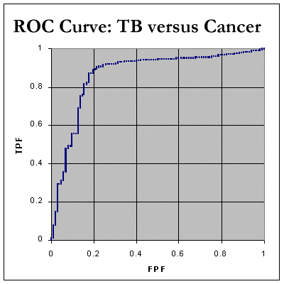
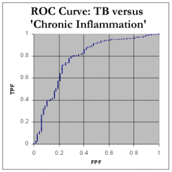
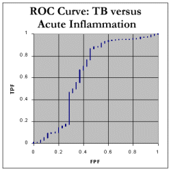
We still need to determine the Area Under the Curve (AUC). We do this by noting that every time we move RIGHT along the x-axis, we can calculate the increase in area by finding: (how much we moved right) * (the current y value) We can then add up all these tiny areas to get a final AUC. As shown in the spreadsheet, this works out at 85.4%, which indicates that, in distinguishing between tuberculosis and neoplasia as a cause of pleural effusion, ADA seems to be a fairly decent test! Here are the corresponding ROC curve for tuberculosis compared with inflammatory disorders. As expected, the AUC is less for chronic inflammatory disorders, about 77.9%, and pretty poor at 63.9% for 'acute inflammation' which mainly represents empyemas.
Note that there were only 67 cases of "chronic inflammatory disorders", and thirty five with "acute inflammation". Finally, let's look at TB versus "all other" effusion data - there were 393 "non-tuberculous" cases. The data include the above 'cancer' and 'inflammatory' cases. The AUC is still a respectable 78.6%. 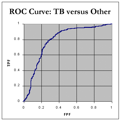
Is the above credible?Through our analysis of ADA in pleural fluid, we've learnt how to create an ROC curve. But we still must ask ourselves questions about error and bias! Here are a few questions you have to ask - they will profoundly influence your interpretation and use of the above ROC curves:
(Makes you think, doesn't it?) { Just as an aside, it's perhaps worth mentioning that the above ADA results are not normally distributed, for either the 'tuberculosis' or the 'neoplasia' samples. Even taking the logarithms of the values (although it decreases the skewness of the curves dramatically) doesn't quite result in normal distributions, so any ROC calculations that assume normality are likely to give spurious results. Fortunately our calculations above make no such assumption.} Working out Standard ErrorsYou can calculate Standard Errors for the Areas Under the Curves we've presented, using the following JavaScript calculator. It's based on the formulae from above.
Footnotes
1. Exploring Accuracy
Accuracy, PPV and NPVIt would be great if we could lump things together in some way, and come up with a single number that could tell us how well a test performs. One such number is represented by the area under the ROC. Another more traditional (and far more limited) number is accuracy, commonly given as: accuracy = number of correct diagnoses / number in total population While we're about it, let's also consider a few other traditional terms:
KISS(2)We will refer to positive predictive value as PPV, and negative predictive value as NPV. Accuracy we'll refer to as 'accuracy' (heh). An examination of 'accuracy'Let's consider two tests with the same accuracy. Let's say we have a population of 1000 patients, of whom 100 have a particular disease (D+). We apply our tests (call them T1 and T2) to the population, and get the following results.
See how the two tests have the same accuracy (a + d)/1000 = 95.5%, but they do remarkably different things. The first test, T1, misses the diagnosis 40% of the time, but makes up for this by providing us with few false positives - the TNF is 99.4%. The second test is quite different - impressive at picking up the disease (a sensitivity of 95%) but relatively lousy performance with false positives (a TNF of 95.5%). At first glance, if we accept the common medical obsession with "making the diagnosis", we would be tempted to use T2 in preference to T1, (the TPF is after all, 95% for T2 and only 60% for T1), but surely this depends on the disease? If the consequences of missing the disease are relatively minor, and the costs of work-up of the false positives are going to be enormous, we might just conceivably favour T1. Now, let's drop the prevalence of the disease to just ten in a thousand, that is P(D+) = 1%. Note that the TPF and TNF ( or sensitivity and specificity, if you prefer) are of course the same, but the positive predictive and negative predictive values have altered substantially.
(Okay, you might wish to round off the "fractional people")! See how the PPV and NPV have changed for both tests. Now, almost five out of every six patients reported "positive" according to test T2, will in fact be false positives. Makes you think, doesn't it? Another example
Now let's consider a test which is 99% sensitive and and 99% specific for the diagnosis of say, Human Immunodeficiency Virus infection. Let's look at how such a test would perform in two populations, one where the prevalence of HIV infection is 0.1%, another where the prevalence is 30%. Let's sample 10 000 cases:
If the disease is rare, use of even a very specific test will be associated with many false positives (and all that this entails, especially for a problem like HIV infection); conversely, if the disease is common, a positive test is likely to be a true positive. (This should really be common sense, shouldn't it?) You can see from the above that it's rather silly to have a fixed test threshold. We've already played around with our applet where we varied the test threshold, and watched how the TPF/FPF coordinates moved along the ROC curve. The (quite literally) million dollar question is "Where do we set the threshold"? 2. Deciding on a test thresholdThe reason why we choose to plot FPF against TPF when we make our ROC is that all the information is contained in the relationship between just these two values, and it's awfully convenient to think of, in the words of Swets, "hits" and "false alarms" (in other words, TPF and FPF). We can limit the false alarms, but at the expense of fewer "hits". What dictates where we should put our cutoff point for diagnosing a disease? The answer is not simple, because we have many possible criteria on which to base a decision. These include:
Soon we will explore the mildly complex maths involved, but first let's use a little common sense. It would seem logical that if the cost of missing a diagnosis is great, and treatment (even inappropriate treatment of a normal person) is safe, then one should move to a point on the right of the ROC, where we have a high TPF (most of the true positives will be treated) at the cost of many false positives. Conversely, if the risks of therapy are grave, and therapy doesn't help much anway, we should position our point far to the left, where we'll miss a substantial number of positives (low TPF) but not harm many unaffected people (low FPF)! More formally, we can express the average cost resulting from the use of a diagnostic test as: Cavg = Co + CTP*P(TP) + CTN*P(TN) + CFP*P(FP) + CFN*P(FN) where Cavg is the average cost, CTP is the cost associated with management of true positives, and so on. Co is the "overhead cost" of actually doing the test. Now, we can work out that the probability of a true positive P(TP) is given by: P(TP) = P(D+) * P(T+|D+)
= P(D+) * TPF
In other words, P(TP) is given by the product of the prevalence of the disease in the population, P(D+), multiplied by the true positive fraction, for the test. We can similarly substitute for the three other probabilities in the equation, to get:
Cavg  = Co + CTP*P(D+)*P(T+|D+) + CTN*P(D-)*P(T-|D-)
          + CFP*P(D-)*P(T+|D-) + CFN*P(D+)*P(T-|D+)
Another way of writing this is:
Cavg  = Co + CTP*P(D+)*TPF + CTN*P(D-)*TNF
          + CFP*P(D-)*FPF + CFN*P(D+)*FNF
Remembering that TNF = 1 - FPF, and FNF = 1 - TPF, we can write:
Cavg  = Co + CTP*P(D+)*TPF + CTN*P(D-)*(1-FPF)
          + CFP*P(D-)*FPF + CFN*P(D+)*(1-TPF)
and, rearrange to ..
Cavg  =      TPF * P(D+) * { CTP - CFN }
          + FPF * P(D-) * { CFP - CTN }
          + Co + CTN*P(D-) + CFN*P(D+)
As Metz has pointed out, even if a diagnostic test improves decision-making, it may still increase overall costs if Co is great. Of even more interest is the dependence of Cavg on TPF and FPF - the coordinates on an ROC curve! Thus average cost depends on the test threshold defined on an ROC curve, and varying this threshold will vary costs. The best cost performance is achieved when Cavg is minimised. We know from elementary calculus that this cost will be minimal when the derivative of the cost equation is zero. Now because we can express TPF as a function of FPF using the curve of the ROC, thus:
Cavg  =      ROC(FPF) * P(D+) * { CTP - CFN }
          + FPF * P(D-) * { CFP - CTN }
          + Co + CTN*P(D-) + CFN*P(D+)
we can differentiate this equation with respect to FPF, and obtain:
dC/dFPF  =      dROC/dFPF * P(D+) * { CTP - CFN }
          +  P(D-) * { CFP - CTN }
Setting dC/dFPF to zero, we get:
dROC/dFPF * P(D+) * { CTP - CFN }
         = -  P(D-) * { CFP - CTN }
or, rearranging:
                P(D-) * { CFP - CTN }
dROC/dFPF  =    -------------------
                P(D+) * { CFN - CTP}
In other words, we have found a differential equation that gives us the slope of the ROC curve at the point where costs are optimal. Now let's look at a few circumstances:
Fine Print - Old fashioned assumptions of Normality
Earlier literature on ROC curves often seems to have made the unfortunate
assumption that the underlying distributions are normal curves.
(The only reason we used normal curves in our applet is their convenience -
perhaps the same reason that others have 'assumed normality').
Under this assumption, one trick that has been used is to create special
'graph paper' where axes are transformed according to the normal distribution.
('double normal probability co-ordinate scales').
Using such coordinates, ROC curves become linear (!), and one can read
off slope and axis, which correspond to the two parameters that contain
the mean and standard deviation. Curve fitting can be done (using special
techniques, NOT least squares) to work out the line that best fits the
plotted coordinates. Such methods appear to have been applied mainly
in studies of experimental psychology.
d' = (mD+ / mD-) / s References
| |||||||||||||||||||||||||||||||||||||||||||||||||||||||||||||||||||||||||||||||||||||||||||||||||||||||||||||||||||||||||||||||||||||||||||||||||||||||