1. Image syntaxThe simple, easy and completely incorrect way that you insert an image into a document is just:
The above should insert a picture of your dog fido into your web-page. In fact, it probably will. Why then is it so totally, completely, abysmally, horrendously, flesh-creepingly wrong? Three reasons:
Okay, so what's so bad about not doing the above? Well, firstly many browsers won't start displaying the page on the screen if they don't know how big an image is until the whole image is loaded. Your reader stares at a blank page for minutes while the image is loaded across her slow connection! Secondly, there are still people who turn off all images (saving time)! If you don't label your image, they have little idea what should occupy the irritating blank space on their screen. Thirdly, it's really rather important to get your head in order before you create your web page. Plan how your website will look, and store files appropriately in a hierarchy of directories. One symptom of a disorganised website is a mix of images and html files (Okay, we've also been guilty of this in the past - do as I say, not as I have done)! Now that you're thoroughly intimidated, here's a better version:
See how we did this - we've put in the width and height of the image, and also the alt section which describes the image. Much prettier. 2. Where can I steal images?Erm. That's not such a good idea. Not, you understand, because we are necessarily (in principle) against wanton purlioning of pictures! It's simply that, although you'll find pictures of almost anything you want out there on the Web, often they are:
We would humbly suggest that you get hold of a digital camera (it doesn't have to be that fancy) or simply get access to a scanner so you can scan in conventional photographs. In addition, software that can create and edit images is vital. This doesn't have to cost you an arm and a leg. Our personal favourite (for several reasons including ease of use) is Paint Shop Pro, from Jasc software. It's really inexpensive, powerful, user-friendly and no, they didn't pay us anything to say this! (Order the CD ROM, don't try and download the program unless you have a super fast connection). From now on we will assume that you have free access to images, and that you can resize them at will! Okay, so you have your fancy new digital camera that can take pictures 1800 by 1200 picture elements (pixels). So you take a picture of your faithful dog fido, and put this on the front page of your brand new website mydogfido.com, right?
The golden rule for inserting pictures into web-pages is DON'T. Think again. Are you sure you want to put in a picture? Still don't. Think again, then only put in the picture, and make damn sure that it's small. We don't mean small as it appears on the page. We mean that the file containing the picture doesn't occupy much memory - the bigger the file, the slower it will download onto the unfortunate user's computer. One or two kilobytes-sized files are reasonable. Ten K is oKay. One hundred and sixty K (Occasionally encountered on the front pages of presumably intellectually challenged website designers) is a total outrage! 3. File formatsThere are literally hundreds of different picture formats. Several are in common use including .JPG, .GIF, .BMP, .TIF and, notably, .PNG. Unfortunately most web browsers only support two:
This dearth is rather strange, as the PNG format is better than both, but can be easily explained - mix stupidity and inertia in equal proportions, and there you have it! Mmm. Perhaps that's a bit unfair. GIF and JPEG have been around for so long that they are more-or-less standards. Both have their limitations. 3.1 JPEG imagesUse this format when you want to display pictures that contain a lot of fine detail. Up to 16 million colours (does this number seem familiar?) can be represented in JPEG images. JPEG uses a fancy compression technique called the Discrete Cosine Transform to reduce the amount of information contained in an image - in other words, if you store an image as a .JPG file, some information is lost (This is called 'lossy' compression). The amount of information loss can be controlled by a compression factor. Any good graphics software should permit you to manually change this compression factor. Generally, if you use compression factors of under about 20 (i.e. 20:1 compression) JPEG images are well-preserved, and you can save a surprising amount of space. If you have a big bulky image, try compressing it a bit more!3.2 GIF imagesGIF is a proprietary format - ie it is owned. A few years ago, the owners tried to collect on this (i.e. charge you money every time you distributed a .GIF file) and you can still hear the faint echoes of the outraged screams that reverberated around the internet. You are unlikely ever to be charged if you make a GIF.GIF compression is lossless. Use GIF files if you have a snazzy image with only a few colours. You will generally get better compression with GIF if you use fewer colours - remember that in any case you are limited to 256 colours in a GIF file. Note that there is generally no point in reducing the number of colours in a JPEG image - rather increase the compression ratio. A rather sexy feature of GIFs is that you can make areas of the picture transparent, so the background shows through. Most useful! (Note that in PNG, you can even vary the degree of transparency, something that cannot be done in GIF. It's a real pity we have no PNG-aware browsers around). Yet another incentive to use GIFs is that you can turn gifs into moving pictures (The GIF file is made into a series of 'frames', each of which is shown in turn). Although cute, you should generally avoid such fancy GIFs, as they tend to become bulky and take time to download. But don't see this as a proscription - in some circumstances, they're just the thing! 4. Really fancy imagesA lot of the impact of a web page depends on your creativity, rather than on how fancy the images on the page are. Use your imagination, and avoid big files. Note that you can even play videos on the web - but this needs an extra plug-in, the quality is not great, and using a slowish connection, takes forever!Some will argue that internet connection speeds are always increasing, and will reach a point where you can plonk any size of image on the net with minimal fuss. We are not convinced - generally, as the bandwidth increases, so the usage increases even more, and we're back to square one! Together with your images you can use things you have learnt before. Try the following:
Save the file under the poorly mnemonic name of say page4.htm. Note that you haven't yet created the page "ripper.htm" - it's a broken link. We assume that you have the creativity to actually go out and find / take / create a reasonable picture of a dog. Remember to put the right width and height in (What happens if you don't?). Here's what you should see when you open up the page:
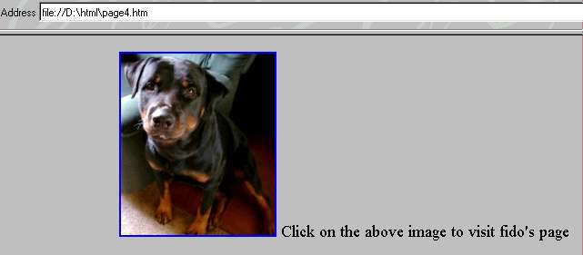
Note the rather crappy image quality - we used high a compression factor when storing the actual image you see on the screen. But there are several other important points to this demonstration.
The first problem - the text to the right, is unfortunate, but easily fixed. Just put in a <br> after the image and before the text "Click on the above..". The blue border is an unfortunate side effect of our having turned the picture into a clickable anchor. The way you turn this off is by adding border="0" into the <img > tag. Try this. Play around a bit with the above file. Make the file "ripper.htm" and
click on the image to go there. Move the </a> closing tag
to after the "Click on the above.." text. How do things change?
The above (put into the <body > tag) sets the background to a colour gradient contained in the
tiny (about 1/2 a K) file swoosh.jpg - the actual file we've
used to create the background for the page you're reading.
Take a look at this file: right click on the background of the page,
choose Save background as in your browser, calling the file
swoosh.jpg. Then open the file in your image editor. How big is it?
Just three pixels high but 1280 pixels wide!
Note that despite the tiny 3 pixel height, the colour continues vertically
forever!
This is because if you set a background image and it's too small to fit
the page, it is relentlessly duplicated both vertically and horizontally,
as needed. This also tells you that if you create a background file and
you don't want an embarrassing duplication on the right, make it wide.
How wide? Well, that depends on the pixel width of the screen
display of the person reading your page. As you have no way of determining
this, and there is sure to be some twit out there who reads everything in
1024 by 768 resolution, either make your backgrounds wide, or the
duplication inoffensive. We generally prefer the latter!
You're now nearly ready to attack almost any web page idea that you
have in mind. But first..
|
